
|
|
Huggies Walking Calendar
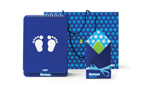
Firstly, it is a corporate product that is supposed to be an interesting present creating a festive mood. Functionality and unique idea should be combined in this calendar. These factors are decisive to stimulate people to place the calendar on their desktop for a year. It’s supposed to serve as another reminder of the care and protection provided by HUGGIES to the babies’ skin.
The usage of corporate colours is recommended.
Target audience is formed of the people directly related to the brand promotion and contacting with the end user: management of the HUGGIES distributors, local sales managers, pediatricians.
The calendar should faithfully represent the brand philosophy and basic values.
HUGGIES brand philosophy implies joy, pleasure, freedom of discovery and learning of the wonderful world, comfort and liberty of welfare. HUGGIES allows a baby to walk easily through the life, learn the surrounding world and not to care of the “small problems” that might happen.
In HUGGIES’ eyes, each baby is an individual. The child’s world is unique and amazing and play is a serious business.
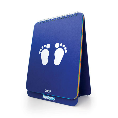
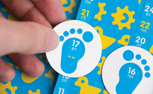
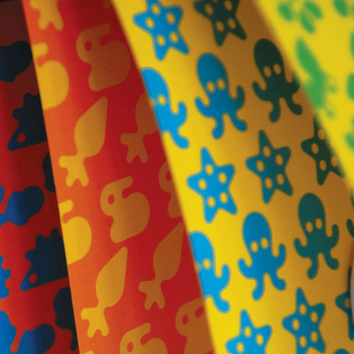
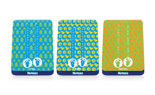
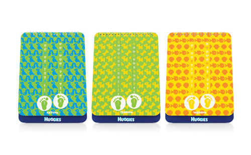
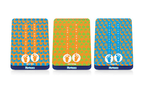
They’ve created the idea of two “baby’s feet”, that move along the page imitating the baby’s steps and showing the current day. This method faithfully represents the freedom of motion, the processes of baby’s development and learning. Every new day is a step forward. HUGGIES corporate colours: blue, green, yellow, orange stand for winter, spring, summer and autumn. The surrounding world is shown as a pattern of simple things from which a baby starts to discover the world. The calendar is made of colour paper by silk-screen printing. It looks childlike and innocent, as if it was hand-made.
Advertising Agency: Yurko Gutsulyak
Client: Kimberly-Clark Ukraine
|
